Is Your Design Minimal or Nonexistent?

Minimal web design is popular, but there’s more to it than trendiness or lazy designers.
Like any style, minimalism is loved by some and hated by others. And to the untrained eye there might not be a lot of difference between a webpage that is under-designed and a page that is simple and minimal, but the difference in the design execution is huge. In web design, minimalism means a lot more than sparse. Using the principles of minimal design to simplify your site can shorten load times, facilitate responsiveness, and help with usability.
The primary goal of minimalism is to remove all unnecessary design elements to create something usable without clutter. But it requires the skill to recognize when usability and functionality have actually been compromised by trying to be too minimal. And when there aren’t superfluous graphics to hide behind, basic design principals and attention to detail become even more important.
Tips for designing minimal and simple sites:
Minimal design is all about white space and creating breathing room to let minimal content really shine and give the user's eyes a place to rest. The challenge is in knowing where to stop. Too much white space leads to a uninteresting, unmemorable site.
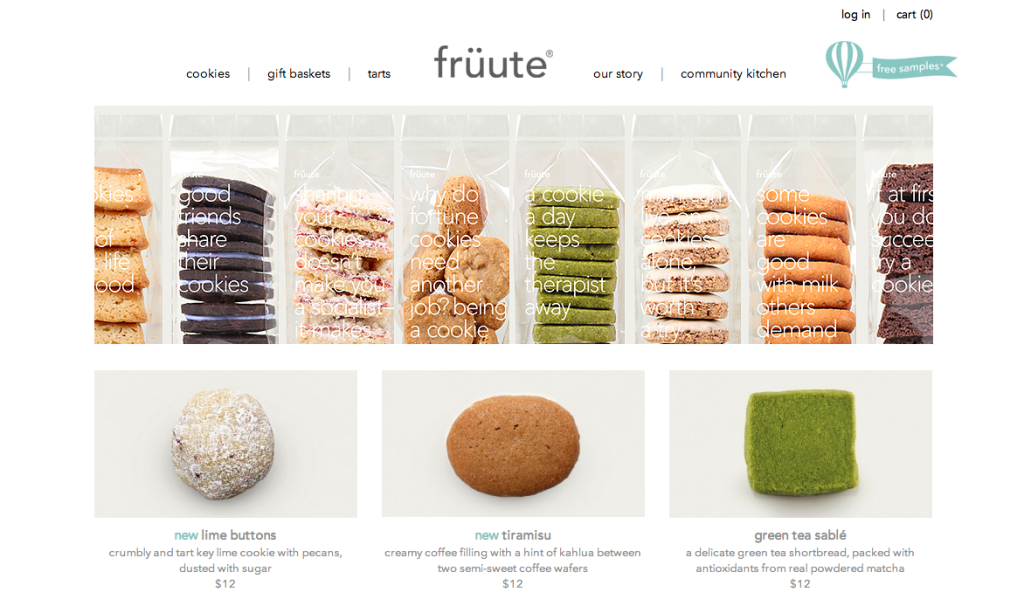
Check out the gorgeous use of white space at fruute. White space in the page design (and the photo composition) helps to make the product the star of the page.
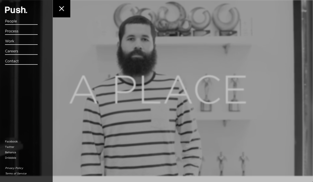
Minimal web design shouldn’t limit your range of style. The goal shouldn’t be one, unoriginal look. You can still use color, type, and photography to convey a range of emotions. For example, Push. conveys a light yet professional tone with their modern black and white page design.
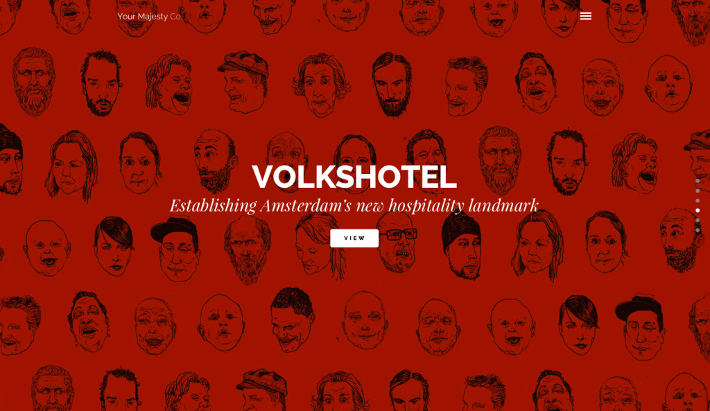
In contrast, Your Majesty creates a more dramatic site with deep, moody colors and classical imagery.
Remove as much as you can until the site breaks. This means the site itself, the content, and/or the usability - but if you’re no longer achieving the project goals, you’ve gone too far.
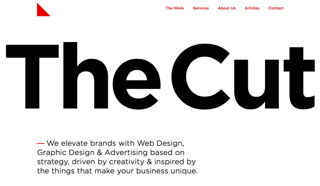
The things you remove might include unneeded icons or graphics, taglines, or entire pages if they don’t contribute enough valuable content to the site. As another example, The Cut keeps things very minimal with their tight homepage design. The primary content of the site is front and center with gorgeous, simple typography.
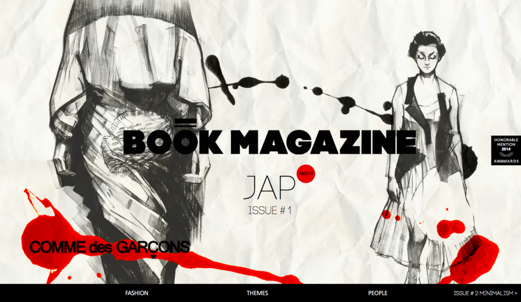
Focus on perfecting (and simplifying) typography and imagery. Every piece of content that remains in your design should effectively convey your tone and guide your users in the simplest way possible. Note the attention to detail in graphics, colors, and type at Book Magazine:
Remember: Minimalism Isn't Always Right
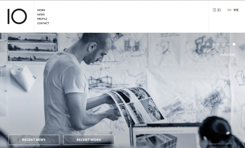
Minimalism is not the solution to every design problem. Take this minimal site as an example. The page layout and colors are simple. The site has been paired down so that most pages don't even scroll past the fold. But the usability of the homepage is compromised by a huge slider that takes a long time to load and doesn't help guide the user in any meaningful way.
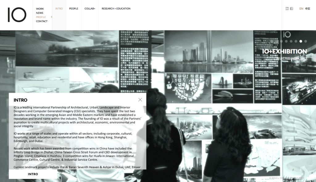
On sub pages, content gets relegated to a small box with questionable typography and the slider remains in the background, forcing users to try to read while images change behind the text.
I'm not saying this website is awful — though there's plenty of awful on the web — but if the designers had thought more about the user experience and less about being minimal it could've been better. So remember, if you design with content and users in mind, you can still utilize the principles of minimalism to simplify your designs and improve the performance of any site. Now get to it!
For more minimalism eye candy check out these sites:
Latest Articles

8 Ways to Optimize Your WordPress This Week
We use Wordpress to build all of our sites. In this article we’ll share 8 tips for optimizing your WordPress website for improved performance and functionality. From choosing a lightweight theme to optimizing your images, these strategies will help you get the most out of your site.
Continue reading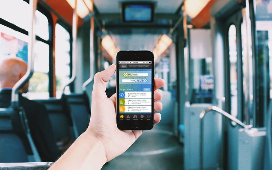
Transportation Mobile Apps: 10 Cool Features for a Better User Experience
A mobile app may not always make sense for your transportation project, but when it does, consider some of these great examples of how the right user experience can kick things up a notch.
Continue reading