"The Fold" in the New Mobile Web
There have been a plethora of blog articles for and against "the fold," as well as just as many debating if the fold even exists. Here at Monkee-Boy, we hear both sides of the argument regularly from our clients and peers in the design community alike. We'd like to discuss what it is, whether or not we should worry about it, and what that practical application means in web today.
History
The concept of "the fold" historically originated from the world of print design and newspapers. The first side of the paper you would see, when one was bundled in a stack or before it was picked up, was the content that was considered "above the fold." This content was generally considered the most valuable when it came to catching a reader's attention and convincing them to buy the paper, and therefore designers and editors were pressured to squeeze as much relevant information at the top as possible. This concept translated to web in the era of tiny displays (think 800x600) and awkward click-and-drag scrollbars. In web design, the term “fold” means the line dividing the initially viewable content, and the content that a user must scroll to see. The technology was new, mouse wheels and touch screens hadn't been invented yet, and at the time it made perfect sense for the majority of users. The downsides to designing above the fold were many. Text had to be small, even headers, as fitting as much of it as possible was the goal. White space was relegated to the outsides of the page, as it was generally viewed as not worth the valuable screen real estate. Aside from looking generally terrible, users suffered from lack of information hierarchy, they weren't able to quickly scan pages or be enticed by beautiful oversized product photos. Navigation was awkwardly shuffled to the left or right as to not push down content. Anything below the fold became worthless content by contrast - which wasn't a lot of incentive to keep users on your site. Overall, designing for the fold on the web became a cramped and overstimulating experience at the top of the page, and a barren wasteland lacking worthwhile content at the bottom. But as technology changed, users did too. Thankfully.
The Modern Fold & User Behavior
In an era where flicking touchscreens, pinching and zooming, and swiping across a trackpad are second nature, the idea that "users don't scroll" just doesn't make sense anymore. If the sudden rise in one-page sites isn't enough evidence, consider this:
- Heatmap service provider ClickTale analyzed almost 100,000 pageviews to find out if people view content below "the fold". The result: people used the scrollbar on 76% of the pages, with 22% being scrolled all the way to the bottom regardless of the length of the page. These numbers improved with good design and interesting content below the fold.
- UX Movement claims that "Scrolling has become a second-nature and clicking a chore." Because it's easier on a trackpad or magic mouse to scroll than it is to click, it's actually better to have a longer page then a set of tabs.
- Jakob Nielsen, once a huge proponent of the people-don't-scroll theory, is now saying that people will scroll, but they will only give attention to well designed or interesting elements. He emphasizes the importance of visual anchor points down the page.
The conclusion? People scroll! But good design is still paramount to capturing user attention.
Where is the Fold Anyway? Could I Find it Even if I Wanted To?
Probably not. Along with changing user behavior, technology has been making the actual fold line obsolete at a rapid pace. With an unprecedented number of personal devices capability of a browser and internet connection, your site can be viewed on a desktop, tablet, TV screen, projector, e-reader, laptop, mini tablet, phone, iPod, and more. The fold is at widely different places depending on the device - while you may see the entire site on a TV screen, you may only see an introductory paragraph on an iPad. What this all means is this: picking a pixel height as an average "fold" line is more or less a frivolous pursuit. If you anticipate your user's needs, and put the content they are coming to the site to find exactly where they hope to find it, it's a good design. It should fall on the page where they expect to find it, whether that's in the header, the body, or the footer.
When the Fold Does Matter
As with all things, there are some caveats, and we're not ready (nor do we think it's good practice) to throw the fold away entirely. There are some elements a user should gather instantly from your web presence, such as branding recognize-ability, your company's name, what the site is about. If you're selling patio furniture, and it takes the user scrolling to the bottom of the page to figure that out, you've got more flaws in your design than just a misplacement of the fold. It's also good design practice to include any links or widgets that may be a user's sole purpose for coming to your site. For example, a store locator widget, or a "call us" button on the mobile version of a site. A good designer anticipates what a user is looking for before they even know they need it - that's the content that deserves screen real estate at the top of the page.
Good Design is More Than Placement
Without the fold to worry about, you're free to focus on other strategies to draw users into your website - such as beautiful graphic displays, information hierarchy, writing compelling content, and encouraging user participation. Good design is encouraging users to want to learn more. Do usability testing and heat maps - if important information is getting missed on the site, consider restructuring the page or redesigning the element to be more eyecatching. Consider a "there's more" box to encourage users to move to the next section, whether it is anchoring to the bottom of a browser window to encourage scrolling or interactivity implemented on mouseover. Limit user actions when trying to increase conversions, to keep users from getting sidetracked. Good design is compelling and engaging, and thinks of the user experience without ever pulling out a ruler.
Latest Articles

8 Ways to Optimize Your WordPress This Week
We use Wordpress to build all of our sites. In this article we’ll share 8 tips for optimizing your WordPress website for improved performance and functionality. From choosing a lightweight theme to optimizing your images, these strategies will help you get the most out of your site.
Continue reading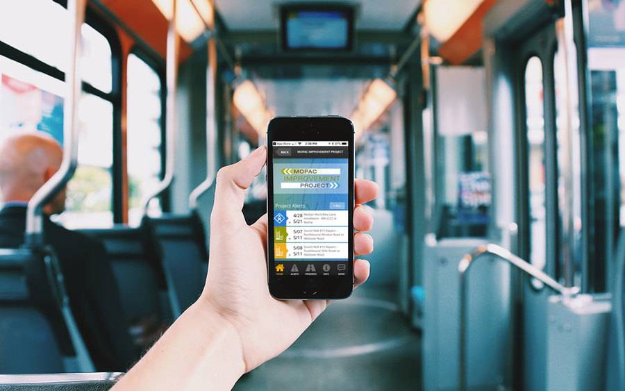
Transportation Mobile Apps: 10 Cool Features for a Better User Experience
A mobile app may not always make sense for your transportation project, but when it does, consider some of these great examples of how the right user experience can kick things up a notch.
Continue reading