Adding Delight to Usable Web Designs

Not too long ago, there was a debate over at UX Mastery over the following statement: ‘We should design for usability, then add delight.’
One camp argued that, yes, good design is the result of a usability first approach, while the other side made cogent points like:
“This is a poor example that assumes that a delight-first approach would compromise on usability. It shouldn’t. We’re not arguing that usability should be compromised. We’re arguing that it should be considered after delight. The other way round limits the possibilities.”
It's a well articulated debate that's worth checking out in its entirety. But it did get us wondering...
We definitely take a usability first approach at Monkee-Boy, but we LOVE delight, too -- as long as it doesn't compromise all the work we've put into making a site highly usable.
So how do you do that? How to you add delight to a good, usability first design?
Demonstrate Your Personality
Successful companies bond with their customers by demonstrating a unique personality.
You can make UI/UX designs personable by conveying your brand’s tone through visuals and copy. Visuals: Colors, fonts, graphics, UI elements that reinforce your brand personality and goals. And Copy: Unique CTAs, error pages and descriptions that show users your unique personality.
You have more freedom with personality if your brand is already wild, or your key demographic has a sense of humor.
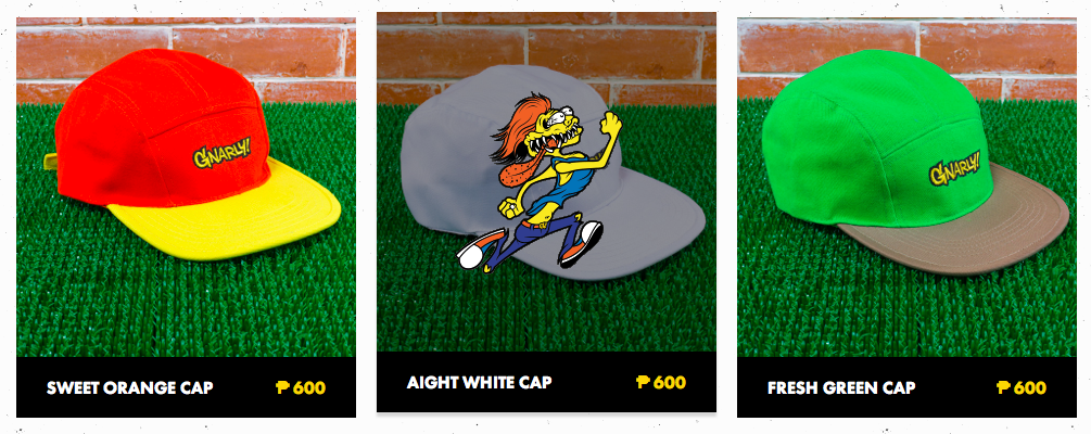
For example, the way Gnarly, a clothing company, uses crazy hover animations to reflect the attitude of their brand and make their customers smile.
Or the way Visionare uses bright colors, vivid illustrations, and whimsical animations to attract and captivate an audience of creative types in search of inspiration.
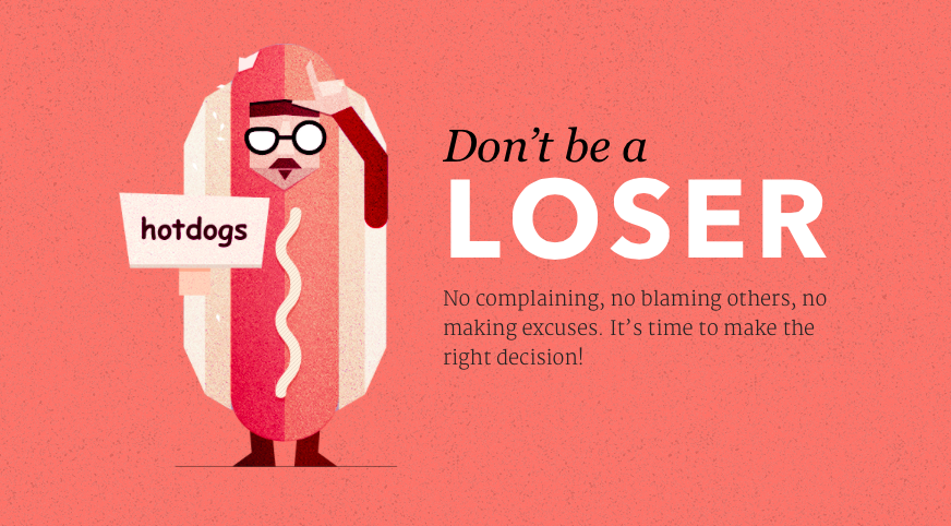
These sites successfully market and sell their services by giving their web designs an edge without sacrificing usability or their end goal of sales or conversion. These tactics work because they know their audiences well and they put tremendous time and effort into creating fun elements.
Be fun for a reason. Be fun because it helps you communicate better with your target audience. Don't be fun because you just want to be fun.
Delightful elements should be subtle.
You must always keep your audience in mind when adding delightful elements to your designs, and the first, and most important question, is DOES DELIGHT BELONG HERE AT ALL?
If you've thought deeply about your audience (hopefully through some persona development and content strategy), and answered yes, delight should be in this design, then and only then you can begin to think about how to go about adding those elements.
Still, you have to keep another question in mind: do you want to convert your user, or do you want to hit them in the face with how fun and quirky you can be so hard that they forget the reason they visited your site in the first place and abandon?
I'm betting you want the conversion. So be subtle with your delight. Don't overdue it.
Here are a couple of example of designs we think do a great job of adding subtle touches of delight:
This Password Indicator on Mapquest's Account Creation
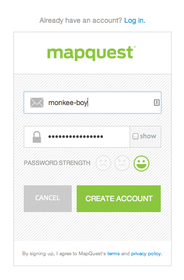
The smiley face password strength indicator is easy to understand and fun.
These sorting tools on Thesaurus.com
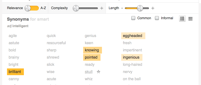
More personality than traditional sorting tools, but just as usable -- if not more so.
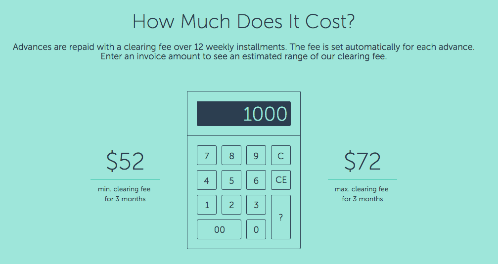
Fundbox's Landing Page Calculator
But don't go too far or you'll end up with design like this:

The typing headline changes, delighting users and supporting the brand message. It's a 10 in 1 watch. It's a 10 in 1 headline.
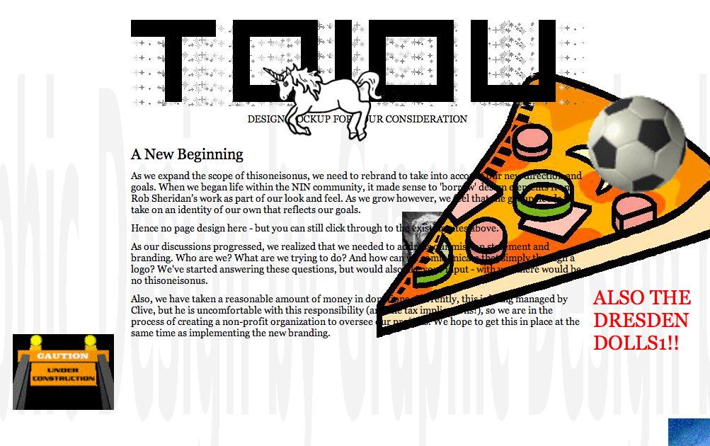
But don't go too far or you'll end up with design like this:
Latest Articles

Accessible PDFs: What Texas Organizations Need to Know
New Texas legislation makes PDF accessibility mandatory for state agencies and highlights broader ADA compliance requirements. Learn why accessible PDFs are non-negotiable, what the real costs of non-compliance are, and how Monkee-Boy can help your organization audit, remediate, and replace inaccessible PDFs.
Continue reading
8 Ways to Optimize Your WordPress This Week
We use Wordpress to build all of our sites. In this article we’ll share 8 tips for optimizing your WordPress website for improved performance and functionality. From choosing a lightweight theme to optimizing your images, these strategies will help you get the most out of your site.
Continue reading