Presidential 404 Pages: Who 404'd Best?
Today is the day. 2016 Texas Primaries.
While the crowd of hopefuls continues to dwindle, tensions still run high. The state of politics in this country is fraught with much of the same vitriol we see every campaign year: finger-pointing, name-calling, and pandering to the lesser qualities of American society.
Indeed, today's politicians haven't changed much. But today, broader audiences of voters are served more and more information about the candidates.
Things have actually changed a lot for politics on the web over the last eight years, and much of that change has been good for the average voter, in theory. Digital media is more robust and human-focused than ever, which better allows us all to absorb as much information as possible about each candidate. That's not to say that all of the content served to the average voter is in any way helpful at the ballot box. (Though it certainly is entertaining.)
We could write an entire blog series dedicated to critiquing political content and the candidates’ online brands. Let's have a little fun instead, and learn something about good UI/UX.
What is a 404 Error?
Have you ever peeked inside someone's refrigerator just out of curiosity? Is it clean and tidy? Full of fast food leftovers? Or worse -- Is it empty? What does that tell you about the person?
A website’s 404 page is like a brand’s refrigerator. It can tell you whether that brand is organized enough not to forget the little details that make a user’s journey better. Good 404 pages nudge the user in the right direction on the site. The best 404 pages do so by employing creative, on-brand content. Bad 404 pages… Well, we will get to those in a minute.
An HTTP 404 Not Found error occurs when a user tries to go somewhere that doesn’t exist on a website. There are two main reasons this happens:
- The information has moved to a different location on the website, but links still exist which point to the old URL. These are called “broken” or “dead” links.
- The user incorrectly typed the URL into the browser.
When we redesign a new website for our clients, the permalink structure and site architecture change. We always come up with a redirect strategy to combat broken links to old URL’s meant for older versions of a website. Setting up redirects takes care of the issue of dead links, but doing so doesn’t mean you don’t need a 404 page.
Believe it or not, people still type URLs into browsers. Even if you have followed a solid redirect strategy, you still need a 404 page to account for user error. And unless you have the uncanny ability to read the minds of each and every user who visits your website, that 404 page shouldn’t auto-redirect to any other page. There is nothing users hate more than a backseat driver.
Presidential 404 Error Pages
Hillary's 404 Page
We are simply torn about this ducky 404 page. Pun intended. If you’re a presidential candidate, chances are that humor often takes a backseat. So, we like the funny photo and cute copy on this 404 page.
The only prominent CTA is to sign-up to volunteer for Hillary’s campaign, which is a good forward path in general. The big logo at the top navigates to the homepage, which is fine too. But this error page could have been made better with a search bar or a few more navigation options or, at the very least, some copy letting users know that the campaign logo takes them home.
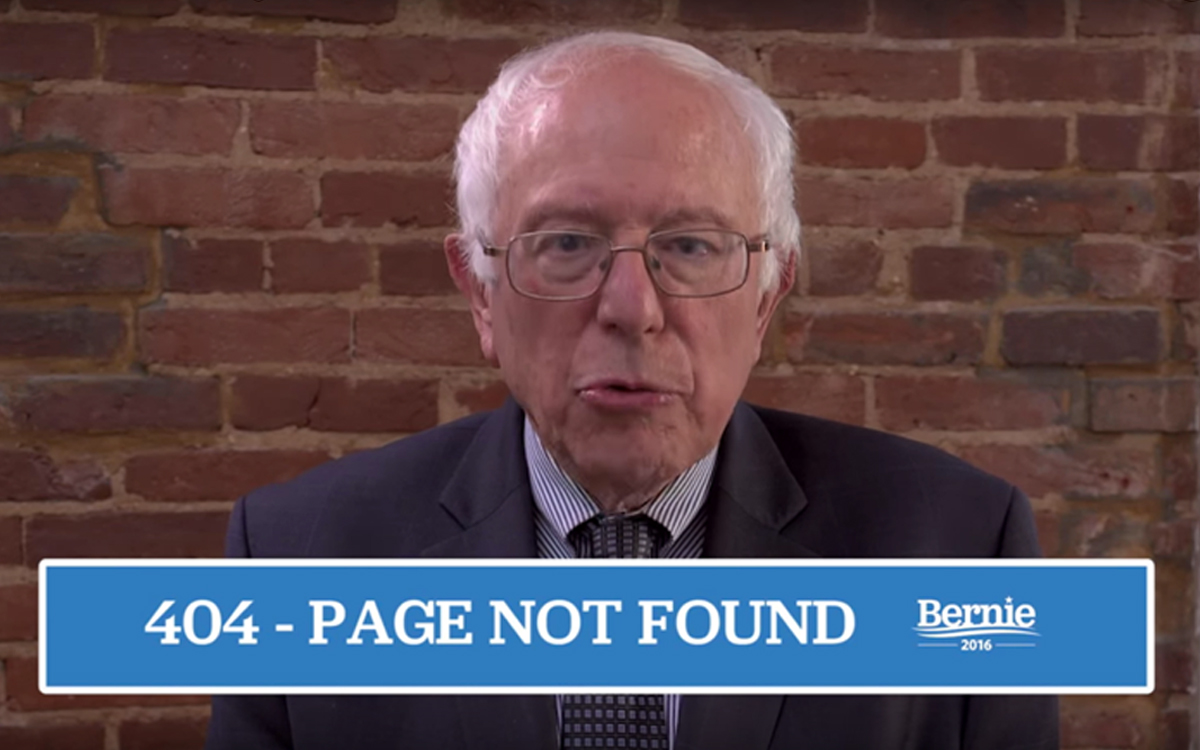
Bernie's 404 Page
As if we didn't already love Bernie. He's clear, concise, to the point, and so is his digital content. He took the time out of his busy campaign schedule to shoot a quick video for the people who lose their way on his website. It's serious, but so is Bernie.
Unlike Hillary's website, Bernie's gives users plenty of navigation options with a top nav, a lower nav, and an e-mail sign-up CTA.
Ted's 404 Page
Ah, bacon and guns. This 404 page is very... Ted Cruz!
Ted Cruz is from Texas, so he has that going for him. We like bacon and Texas. We also like that this page offers lots of navigation options for the lost user.
We like calls-to-action, but there isn't a lot of method to this madness. The 'Hungry for freedom? Join us.' CTA leads to a volunteer sign-up form on a separate page -- Not the best UX practice for a form, not the worst either. Almost immediately below that, the user is served with a 'You Matter. Join The Movement.' callout and a simple e-mail sign-up form -- Better UX. And directly below that, a donation CTA with some nice functionality.
Why are there three CTA's with inconsistent styling directly on top of one another? Why are there three locations with social icons and / or forward paths on this page? It's all very inconsistent and redundant.
We suspect that Cruz threatened to shut down the government if his web strategists refused to meet his every demand. We feel their pain.
Kasich's 404 Page
This 404 page does what it's meant to do. It gives the user top and lower navigation options. The donate button is useful though a form would have been better.
But if we're being completely honest, this 404 looks like an afterthought, and someone knew it. That's why they slapped a picture of a *kitten on the page.
Ben Carson's 404 Page
Ben Carson will probably be best remembered for his bizarre entrance to one of the debates. He certainly won't be remembered by this 404 page. It has all the navigation elements we like to see, but none of the character. Telling.
Rubio's 404 Page
This 404 page is not the worst of the bunch by any means. It speaks to the all-American Rubio brand. Whether or not that brand speaks to the voting majority remains to be seen.
Our one major complaint here is the CTA language. 'Go Home' or some forward path messaging would have been better than 'Enter Site' because some users will already have been on the site when they encounter the 404 page.
Trump's 404 Page
Interesting. There is just one line of copy on this page:
"The page requested could not be found. If you feel this is an error please contact us."
Missing comma aside, we're a little surprised! Trump's boisterous personality and reality-show past could have made for some pretty hilarious 404-page content. At least, the users have plenty of navigation.
Which Candidate has the Best 404 Page?
None of the above.
President Obama might be out of the oval office in 324 days, but we still love the simple navigation options and the smart, unapologetic GIF animations on his 404 page. #ThanksObama indeed.
Latest Articles

Accessible PDFs: What Texas Organizations Need to Know
New Texas legislation makes PDF accessibility mandatory for state agencies and highlights broader ADA compliance requirements. Learn why accessible PDFs are non-negotiable, what the real costs of non-compliance are, and how Monkee-Boy can help your organization audit, remediate, and replace inaccessible PDFs.
Continue reading
Four Tips For Hiring a Good SEO Firm for Your Business
In today's SEO climate, where Google penalties can result in all of your web pages getting removed from search results, hiring the wrong SEO company can have disastrous implications on your ability to conduct business.
Continue reading